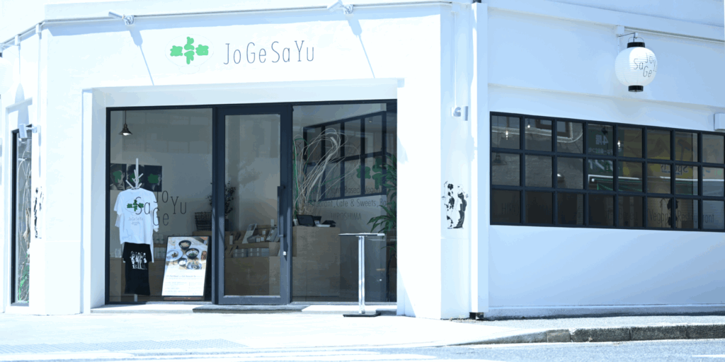
Delivering “deliciousness” for everyone
JoGeSaYu is a restaurant born from the desire to create a place where people from all walks of life—regardless of nationality, culture, religion, values, or allergies—can gather around the same table and share a meal.
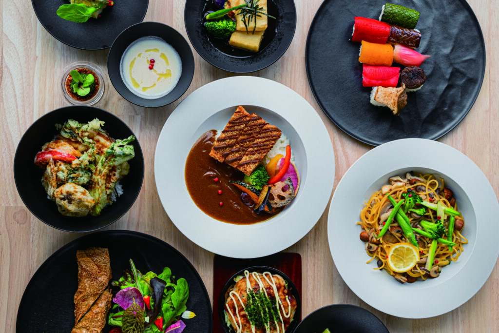
All dishes and desserts served in our restaurant are 100% plant-based, containing no animal products or alcohol. This approach not only accommodates vegans and Muslims but also takes into account a variety of religious dietary restrictions and allergies to animal-derived ingredients.
Because our menu is free from animal products, it is naturally cholesterol-free and lower in fat—making it an ideal choice for health-conscious diners.
In Japan, vegan or plant-based meals are often seen as something for a niche group, or mistakenly thought to lack flavor. At JoGeSaYu, we challenge these stereotypes by focusing on delivering meals that are genuinely delicious—for everyone.
To bring this vision to life, the project is fully produced by Super Sweets Inc. Our culinary director is Chef Katsumi Kusumoto of “Saido,” named the world’s best vegan restaurant in 2019 by the global vegan and vegetarian platform HappyCow. Our sweets are overseen by award-winning patissier Chef Hironobu Tsujiguchi, renowned for his achievements in international competitions and frequent appearances on Japanese television.
At JoGeSaYu, we believe that great food should be accessible and enjoyable, whether or not you have dietary restrictions. From Hiroshima, we aim to share this new kind of dining experience with the world.
About the Name
The name “JoGeSaYu” is written in Japanese as “上下左右,” which translates to “up, down, left, and right.” It symbolizes acceptance of all directions, values, and forms of diversity. The name reflects our mission: to offer a welcoming table where everyone, no matter their background, can feel safe and enjoy a shared meal.
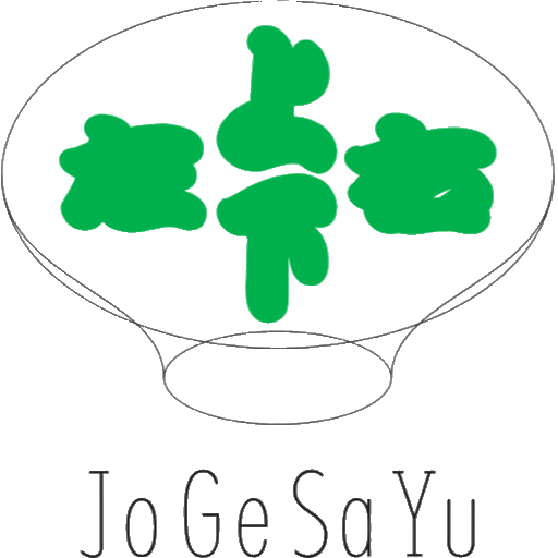
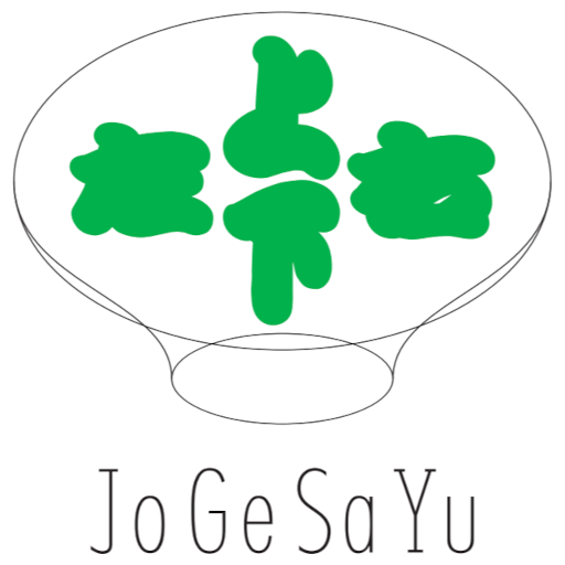
About the Logo
The central characters “上下左右” are based on Kanteiryu, a bold and traditional Japanese script style used since the Edo period in kabuki theater. Our logo reimagines this style with a soft, friendly touch to reflect the warm, inclusive world of plant-based dining.
The characters are enclosed within an oval shape that resembles both a world map and a dining plate—visually expressing our brand’s core messages of diversity, connection, and deliciousness. The green brand color symbolizes not only eco-friendliness and sustainability but also kindness, vitality, and positivity.
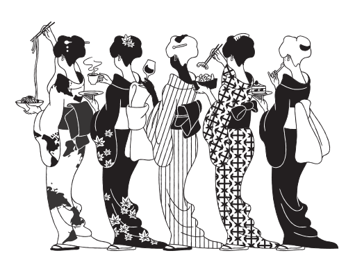
About the Key Visual
To emphasize our identity as a Japanese restaurant, we adopted an illustration inspired by Edo-period bijin-ga (beauty paintings), reminiscent of the famous Mikaeri Bijin (Looking-Back Beauty). The figure features a blend of ethnicities, symbolizing the diversity of people who can come together at our table, transcending borders and cultures.
The kimono pattern incorporates elements such as a world map, maple leaves, and directional arrows—connecting our brand concept with imagery rooted in Hiroshima.
About the Central Installation
At the heart of the space is a white wooden sculpture, representing Hiroshima. Surrounding it are cascading fabrics in our theme colors of green and white.
This centerpiece embodies our name—JoGeSaYu (up, down, left, and right)—and represents a gathering space where people from all directions (north, south, east, west) can connect and unite.